

Lux Buurman is a painter with a great love for materials and their incorporation into classical painting techniques.
For her hands-on REVIEW of MAIMERI’s oil paint, she takes the structure of work from the Flemish Primitives to the Impressionists as a guideline. The most important aspects of the craft are discussed in this blog, from painting on a white ground, on an imprimatur with an underpainting and depiction — layer upon layer — to painting a la prima. This allows her to assess the paint optimally.

The able and diligent 17th century painter Eglon van der Neer came to the following conclusion after a long search for beautiful and solid paint and said to his pupils: Do not look for paints; there are plenty of them that are good, learn to use them well!

The number of pigments used in the 17th century was limited and the most beautiful paintings were made with them. The course was about skill and material knowledge. If you master the craft and have good equipment, you can work wonders with a limited palette.
Well, I can paint in the meantime, and the paint that is available is good….
Then I am asked to test the oil paint from MAIMERI. This is paint that stands for classic quality, with mostly natural pigments in high saturation. On their website I see many beautiful colours. The presentation has been thought through and looks good. Eglon van der Neer would not have believed his eyes at that offer.

➽ I tested three different categories of oil paints
The CLASSICO could be called the middle quality — I’m going to use this quality for an underpainting.
• CLASSICO extra-fine oil colour:
018 Titanium white ○ 535 Ivory black ○ 493 Raw umber ○ 131 Yellow ochre
• TERRE GREZZE D’ITALIA extra-fine oil colour:
○ 031 TGD’IT — Orange earth from Herculanum ○ 036 TGD’IT — Venetian red earth ○ 039 TGD’IT — Green earth from Verona ○ 035 TGD’IT — Raw Sienna
➽ The earth colours used by the old masters were often coarser and more irregularly ground than today. This resulted in a thicker paint and slightly different, somewhat more opaque colours due to a different refraction of light. They liked to use those well-drying earth colours in their underpainting. They often continued to work on this in thinner (glaze) layers, which also adhere excellently to such a coarser underpainting.
In the TERRE GREZZE D’ITALIA range you will find these authentic earth colours, with pigments from small Italian quarries that have often been in use for centuries. The average pigment load is 60% – 75% and the average grain size is 50 – 100 microns.
I am also going to use these colours for an underpainting.
• PURO superior oil paint:
018 Titanium white ○ 020 Zinc white ○ 493 Raw umber ○ 492 Burnt umber ○ 131 Yellow ochre ○ 116 Primary yellow ○ 317 Cobalt green deep ○ 374 Cobalt blue deep ○ 392 Ultramarine deep ○ 368 Cerulean blue ○ 281 Vermillion ○ 183 Magenta Lake ○ 466 Quinacridone violet
The PURO is the professional quality. All colours are mono-pigmented and rubbed in safflower and/or poppy oil. They are super-concentrated, with unparalleled depth and impeccable purity. I choose several classic colours, which I know best. I also used two red colours that are new to me.
Partly I made my own medium, partly I used these ready-made mediums from MAIMERI:
• PURO 704 Glazing Medium
This is a viscous medium based on alkyd resin. It accelerates the drying of oil paint and gives the paint film an exceptional shine, transparency and elasticity. Perfect for applying glaciated layers.
• PURO 700 Clear Oil
This drying retardant medium thins the paint and makes mixing on the palette smoother. It emphasizes the undertone of colours, without affecting their purity or brightness.
To dilute my paint, I used:
• Schmincke® BALSAMTURTINE 024
As brushes I used:
• Textura brushes from Raphaël®
• D’Artigny brushes by Raphaël®
• Kevrin brushes from Raphaël®
• Ergonomic detail brushes from GERSTAECKER
• I set up the signature with a silver point.
• As a carrier I chose a Gessoboard (50 cm x 50 cm) from GERSTAECKER.


I made a colour chart on which I laid out the paint in lines. They went from opaque to semi-opaque to transparent. In addition, I also did this with the same colour mixed with titanium white, in a gradient with a little more white each time.
The CLASSICO range does what you can expect from paint. The umber and ochre do not cover very strongly, but well enough. The raw umber and ochre of this range are fine for the test of the underpainting.
The PURO range surprises. The mass of the paint is pleasant, buttery, and easy to apply. It is also opaque except for the yellow ochre, which is a bit fragile, but I have experienced that before with the authentic pigment. Chemical based ochre cover better, but that is not always an advantage. The colours I have chosen are very bright, even when they are semi-opaque and transparent. Mixed with titanium white, their character is well preserved.
TIP! The titanium white is very pleasant to work with and is particularly opaque. Even on the white gesso board, it is whiter and glows. The zinc white is transparent and cool as it should be.
The PURO colours are also radiant when mixed. The different blues with violet and magenta make intense purples and lilacs. With the primary yellow they make bright greens.

The TERRE GREZZE D’ITALIA range also lives up to its promise. Beautiful full colours, a pleasant mass, easy to apply. The pigment grain is larger than with the PURO range and you can feel it. I like that! It was also a surprise.
This range is beautiful in mixture for incarnate — skin colour. It is funny to notice that the paint has a rougher surface than the other paint after drying. It feels, I think, the coarser pigment grain and feels kind of Special.
That is it for the experiments.

During Western painting, several techniques have been used that differ quite a bit in approach. That also demands something from the paint.
The Flemish Primitives painted on a white ground. They often made a preliminary drawing with silver point. In the underpainting, the white ground was used for the light and the dark areas were indicated with a grey.
From the 16th century work was on a coloured ground — an earth colour — and the light on it was firmly turned on in the first instance.
From the 2nd half of the 19th century, without underpainting, they worked directly in colour. Often still on a coloured ground.
Because this paint is so intense in colour, I choose to pay tribute to Claude Monet — the painter who put colour on the map!
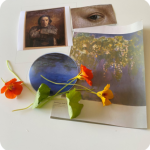
➽ This is the idea

There is a portrait of the young Monet, A classic from the 17th century and painted by his friend Gilbert de Séverac in 1863 — when Impressionism had yet to get its name.
Later, when Monet had conquered his place on the world stage of painters, Cézanne said of him: Monet is only an eye… But what an eye!
I also choose an eye painted by Rogier van der Weyden (15th century), painted in the manner of the Flemish Primitives on a white background. A blue-green eye surrounded by a delicate skin colour.
In 1859 the cobalt violet was invented and chromium oxide green in 1862. Then comes colour — Monet’s water lilies and a wisteria: blue, lilac, pink and green.
When the Impressionists were refused participation in the annual Salon in Paris, they held their own exhibition on the Boulevard des Capucines. They called it the Salon des Refuses, 1863. The friends even considered calling their group Les Capucines.
Capucines is not only an order of monks (they wore a pointed hat) but also the name of a flower, Nasturtium. In red, bright orange and radiant yellow, those flowers also appear in the painting.


DAY 1
I first draw the composition with silverpoint on Gesso board. It is a pleasant task as silverpoint and oil paint are friends.
For the imprimatur of the portrait of Monet, I use raw umber and titanium white from CLASSICO. I use my own, quick-drying medium, which I make from linseed oil boiled with lead mixed with mastic varnish — we have been sourcing that mastic varnish from MAIMERI for years, by the way. The paint is good.
For the water lilies and wisteria from Monet I make a pink ground of titanium white from PURO and Venetian earth from TERRE GREZZE. The substance of this combination is firmer and pleasant to apply.

DAY 2
used my own medium and the imprimatur is dry enough to continue the next day. I transfer the drawing and make the underpainting in raw umber with white from CLASSICO. I start with dark areas in the raw umber. Semi-covering is good, getting it really dark is a bit more difficult. The white can be applied well both opaque and semi-opaque.

DAY 3
Now I’m going to use the paint and the PURO 700 Clear Oil medium — medium incolour, colourless medium.
This drying retardant medium thins the paint and makes mixing on the palette smoother. It emphasizes the undertone of colours, without affecting their purity or brightness.
It is a paste that mixed with the paint gives some extra suppleness without the paint becoming liquid and too thin, this works well.
For the background: Raw and Burnt umber and yellow ochre. The intensity of the yellow ochre is nice and warm on the grey-brown imprimatur, the burnt umber also gives a nice warm intensity when applied opaque and semi-opaque.
I give the blouse a transparent layer with titanium white. Then an optical grey is created over the imprimatur.
The white is remarkably pleasant to apply, both in the semi-opaque layer and wet on wet modelling to turn on the highlights on the sleeves. Even a really thick highlight on the collar is very pleasant to apply with a fine brush — I used an Ergonomic Detail Brush from GERSTAECKER for this.
For the dark stripes in the blouse; ivory black from CLASSICO. Also, for the grey on the seat. The face gets a little colour with burnt umber, yellow ochre and white. The substance of PURO is noticeably more pleasant to work with.

DAY 4
The paint that was applied yesterday with the medium is not yet so dry that it can be painted over, logically. That may well take three or four days.
For the underpainting of the eye, I use the titanium white from PURO and the ivory black from CLASSICO.

Only the halftone and the dark areas are depicted in a grisaille, an underpainting in grey. The highlight remains the white of the panel. Painted thinly, so that the silverpoint drawing is still a bit visible and the white of the ground can still give some light from the inside even in the dark areas. I use my own medium again as it dries faster.

DAY 5
Wisteria — now let’s move on to colour! The imperfection is well dry; the paint skin is a little rough from the Venetian earth of TERRE GREZZE, which I like. The Impressionists painted immediately with colour, often on a coloured ground, with a firm visible brushstroke. I am going to use the PURO 700 Clair Oil medium again. I wonder if the firm touch will hold up nicely.
Colours: Titanium white, yellow ochre, Primary yellow, Cobalt green, Cerulean blue, Magenta, and Quinacridone violet.

The purples of Cerulean blue, Magenta and Quinacridone violet are radiant. Also, when mixed with white they are very intense. The greens that Monet uses here are quite soft, bordering on greyish. With Ochre, Umber, Cerulean Blue and Titanium White, Cobalt Green can be mixed in all shades. For a fresher green I mixed it with a yellow. The keys remain in place. Wet on wet, looking for the visible brush movement, the paint can be manipulated well. And, what is nice, is that the colours do not become dull when you use them interchangeably; So, a green key in purple does not get dirty. With the addition of a little turpentine, the wet paint is also good to paint with a fine brush, you can draw thin moving lines, such as the twigs at the bottom left. And even thicker strokes with a clod of paint on the brush also stay well in the wet paint.

Of course, it’s a postcard format that I’m imitating Monet — his painting measures 100 cm x 200 cm. So, there is no really broad brushstroke, but I can imagine that with this substance it will also go very well on a large scale.

DAY 6
The wisteria is of course not dry yet.
The water lilies, that’s a very dreamy painting. I’m not going to paint it too thickly and not concern myself with the brush strokes, but focus on the delicate transitions of the different shades of blue and lilac. The pink ground is a nice support for all nuances. Titanium White, Ultramarine, Cerulean Blue, Cobalt Blue, Quinacridone Violet, Raw Umber, Yellow Ochre, Cobalt green.

I’m really starting to love the titanium white. What a pleasant white this is.
I start with the greens and the blues and work from the edges to the middle. The pink soil is a nice place to put those cool blues on and it almost goes by itself. The colours are really intense. The titanium white is also strong enough to dampen them.
The different colours put together next to each other are very pleasant and work together and also adjust well to wet on wet. I have now used my own medium again because of the drying time.

DAY 7
Everything is dry. To make the water lilies even more dreamy, I give them a total glaze of zinc white.
Now it’s the turn of the TERRE GREZZE, the earth colours from Italy. They are very original pigments. And therefore, extremely suitable for applying a very original technique, and it works! The combination of Orange Earth from Herculaneum, Venetian Red Earth, Raw Sienna and Green Earth from Verona is perfect for skin tone. The Orange earth with titanium white gives a midrange, with more white and some Raw Sienna it is good for the lighter parts. Titanium white, Venetian red and orange earth for the blush. The dark skin colour I made from the orange earth, a little bit of Red earth, Green earth and Titanium white.

I put them next to each other, work them together with a dry brush and adjust the colour here and there. For the whites of the eyes I use the same combinations, with more white. The grey of the underpainting continues to play a role throughout the painting as a whole. The iris surprisingly turns bluish with a glaze of green soil. The grey of the underpainting cooperates… Raw umber is needed for the pupil and the dark edge under the upper eyelid. Again, I like the substance of the paint very much. Both a bit more opaque and transparent. Here and there you can still see the silverpoint drawing through it while the colour is very nicely distributed.
I use the paint that I have on the palette to give Monet’s face which gives extra warmth.


DAY 8
Everything is dry. As icing on the cake, now the Nasturtium. I use watercolours that I made a few years ago, and the flowers from the garden.
I push through the drawing with raw umber and white. Over the wisteria, and over the water on the lily pond. Hear I can see if the overpainting can be applied well to so much colour.
An underpainting with Raw umber and Titanium White is always effective. I do use the PURO because it is more opaque than the CLASSICO. It doesn’t cover right the first time. After an hour or two, the paint has been put on and I can work well in it to practically opaque.
DAY 9
The background is still the white of the Gesso board. I actually want to keep it white, but still put a layer of paint over it. The Zinc White is less impressive on the test panel than the Titanium White. I am also curious about the effect of MAIMERI’s glazing medium. I glaze the whole background with zinc white and the medium. That goes well at first, although I don’t think it went as smoothly as I expected. The medium becomes sticky quite quickly. I am used to being able to continue painting in a wet glaze, which is not going so well now. The Titanium white is considerably whiter than the zinc white, with that I could still add nuances to the white, but I postpone that until the background is dry. To my surprise, this is almost the case in the course of the afternoon. That can be an advantage if you only want to apply a glaze, if you want to continue working in that glaze that is a disadvantage.

DAY 10
It’s now time to add colour on to the flowers. First the leaves, Cobalt green, Ultramarine, Primary yellow, yellow ochre and Titanium white. I glaze the light green with Cobalt green and Primary yellow, then the dark areas with Cobalt green with Ultramarine. In the wet glaze I apply nuances with ochre, white and the different combinations of green.
For the orange flowers I use Vermilion, Primary yellow, yellow ochre, Quinacridone violet and Titanium white. I start with a glaze of Vermilion and Primary yellow. It comes out as a very intense orange-red. It could suffice, but I still want more nuance and it is easy to apply. I put the veins and the thickness of the leaf thicker on top with a little turpentine medium and a fine brush.
With the colours I have on the palette I continue to work in the wisteria to adjust the distribution of the colours so that the cherries stand out well against the background. In doing so, I add some violence to Monet’s composition, but it has to be done. He also did not always stick to the data he saw in front of him and found composition more important than the exact representation.

DAY 11
Primary yellow, yellow ochre, Vermilion, Quinacridone violet, Cobalt green and Titanium white.
First another glaze with the global colour, yellow with a little ochre. The underpainting is a fantastic support and the nuances can be applied to it with white, ochre, a little vermilion and violet in the wet glaze.
The leaves of the water lilies get a hint of green here and there, the lilies an extra light of white and a dot of pink-red.

Where the light in the background peeks through just a little under the ‘postcards’ and the flowers, at the bottom left of the portrait of Monet, at the top right behind the eye, under the green leaf above the wisteria, I illuminate the white even more with Titanium white, Thick white is whiter than thin white. And where there is light, there is space. You may not see it consciously, but it works.
Well… The research is over. All colours have been covered. The different ways of applying paint, throughout the techniques is complete.


Below you can see the latest version of my ode to Monet with the MAIMERI oil paint. Here and there I have increased the contrasts a bit, added shadow, intensified the colours.

My conclusion about this paint is…. Very good!
➽ Beautiful. Intensely bright in colour. Pure. Surprisingly pleasant to work with.


About Lux;
Lux Buurman is a painter with a great love for materials and their incorporation into classical painting techniques.
ISBN 9789491525629

© 2025 — text: Lux Buurman & redactie Gerstaecker NL | © 2025 — image: Lux Buurman, MAIMERI & editors Gerstaecker NL & GreatArt UK


Add comment