

Tips for Colour Matching
Matching colours is so easy peasy! It is often mistakenly thought that only professional artists are capable of creating bold and successful colour combinations. With the help of Amylee Paris, we will prove you wrong!
Easy tip for Matching the right Colours when Painting
You have just made an amazing black and white drawing (in ink or crayon graphite). Do you want to switch to colour? But, you are stuck. You are afraid of spoiling everything with the addition of red, blue or green.
Today I’ll give you a great tip to help you know how match several colours in an artwork with boldness and confidence.
Let’s play with colours:
An artists’ specialty is to try bold colours. However at the beginning of a creative career path, the choice of colours can be a recurring puzzle.
2 solutions are available to us:
- apply the colours as we see them.
- change the colours to what we want to see.
In this situation, I prefer to create an original palette for a painting.
Before emptying the tubes on to the palette, you have to have in mind a sequence of colours. That’s how I always work. I visualize a lot before painting even if I allow myself some changes afterwards.
When I was a child, I loved painting skies, the kind of gradients that suggested the mood of my illustrations. Even today in my paintings, I enjoy doing chromatic combinations. There is something fascinating and magical about colours.
NOTE: In music, it is recommended to practice before playing an instrument so why not practice your colour before painting?
Everything is in Harmony
The key to using colours is a single notion: HARMONY. The secret to a successful harmony lies in a colour wheel.
If like me, you don’t enjoy the system proposed by the colour wheel (too theoretical for my taste), it is possible to make beautiful harmonies in another way. Yes, we can !
Where do you FIND HARMONIES?
Our environment is full of colourful associations: in everything, an ad in a street, a sunset, a dress … Easier still, magazines or the Internet (eg Pinterest) are full of harmonious inspirations that work (according to everyone’s tastes) ). Why not get inspired?
NOTE: When browsing a few pages, we will find that sometimes our eye slows down on a picture. It’s a good sign, that means that the harmony of this image attracts us, tickles us, reflects our preferences or our personality!
The colours make sense:
Simply put, colours can de-crypt a painting:
- The tell a story or talk about an idea.
- The favour an atmosphere: warm, fresh, powdery, foggy, lively, natural, artificial, etc …
- They represent a reading system: the colour wheel, primary or secondary colours, etc.
- They trigger vibrations: the colours either oppose (contrasts), assemble (shades), or answer each other (complementary).
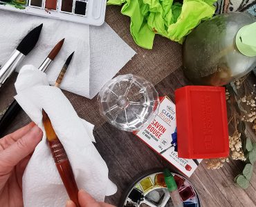
Materials:
For this demonstration, you can use:
- some magazines for cutting
- 1 cutter or 1 scissors
- acrylic paint (gouache or watercolour paint)
- palette paper or tear-Off palette
- brushes, water and Cleaning roll paper (or cleaning cloths)
- a mixing palette (wood, glass or plastic)
These products are currently available at GreatArt Online and can be ordered to collect from their art supply shop in London Shoreditch or delivered to your home.
The Recipe:
- From a magazine, select your favourite picture.
- With the material you have (paints + brushes), try to reproduce the main colours from this picture.
NOTE: This picture can be of great help in colouring a painting or drawing. The trick is to reuse the harmony present in the picture to compose its palette.
- And here we are, a bold colour range ready to paint! Very useful for colouring an artwork, you’ll see!
Did you know?
To check if the paint matches with the picture, hold the tip of the brush (loaded with colour) close to the picture, then blink quickly while focusing your attention on the colour you are checking. Looking at this way makes it possible to judge whether the paint is close (or not) to the colour taken from the picture.
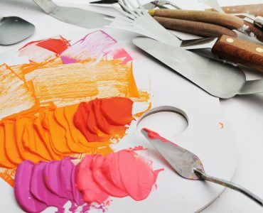
Some pictures from Amylee’s studio:
Colour Range made with acrylic paint on tear-off palette
Colour Range inspired from picture
A method to practice the eye:
Do not hesitate to combine and group colour ranges (from paintings or collages) in a notebook. Tear-off Palettes are great for that because you just have to link the palette paper together and you have a great archive book or notebook!
A fun and creative exercise that helps you combine colours through stories and ideas from memory.
Pages from my Colour Book
Collect Notebooks:
Throughout the pages of your notebook, you can find atmospheres, ideas, stories just in all these colour ranges. It’s very energizing as an exercise, do you see?
And when years later, you fall back on this same notebook, you will have the impression to open box with magical inspirations.
Information for this article was provided by professional fine artist, Amylee Paris. You can visit her colourful portfolio or follow her on Facebook and Instagram.
Find all Amylee’s posts published in GreatArt online Magazine by clicking here!
GreatArt – your art superstore
Art supplies, ideas and advice for all techniques.
GreatArt offers you art supplies for all techniques from:
- traditional fine art painting,
- drawing,
- sculpture,
- printmaking,
- graphic art,
- illustration,
- airbrushing,
- model making…
We offer an extensive range of stretched canvas and display products for exhibition, all the art supplies required to create your own bespoke canvases, as well as custom framing and mounting services from GreatArt Store. You’ll also find hundreds of articles and tutorials to browse in the online magazine.


Add comment